Color Theory in Clothing: The Complete Guide to Dressing with Color
Learn how to apply color theory to your wardrobe — complementary, analogous, and triadic schemes for outfits that feel intentional.

Color theory in clothing is the practical application of the color wheel to building wardrobes — it explains why certain combinations feel harmonious, why some outfits jar, and how to use hue, saturation, and contrast to dress with intention. The framework is simple: a handful of principles from the color wheel, applied to the clothes already in your closet, transforms outfit-building from guesswork into deliberate design. Use the table of contents to navigate.
Color Theory Foundations: The Color Wheel in Your Closet
The color wheel is the single most useful tool for understanding how clothing colors interact. The wheel organizes all visible color into a logical structure: three primary colors (red, yellow, blue), three secondary colors (orange, green, violet), and six tertiary colors formed by mixing adjacent primaries and secondaries.
Color theory for clothes starts with this structure. Every outfit is a color combination, and the wheel explains which combinations work — and why. Colors opposite each other on the wheel create contrast. Colors next to each other create harmony. Colors equally spaced create balance. These three relationships underpin every color scheme you'll ever wear.

The remaining sections translate each of these relationships into wearable, everyday outfits — no art degree required.
Warm vs Cool Undertones: Finding Your Flattering Colors
Undertone is the single most important variable in determining which colors flatter your skin. Warm undertones have a yellow or golden base; cool undertones lean blue or pink. Two reliable at-home tests exist: the vein test (green veins suggest warm, blue veins suggest cool) and the jewelry test (gold flatters warm skin, silver flatters cool skin).
Seasonal color analysis builds on undertone by sorting personal coloring into palettes. Spring and Autumn are warm — think honey, coral, rust, olive. Summer and Winter are cool — think slate, burgundy, cobalt, icy pink. Identifying your undertone eliminates roughly half the color wheel from consideration, making every shopping decision faster and more precise.
A caveat: undertone is a starting point, not a verdict. Many people sit near the boundary between warm and cool, and fabric texture, makeup, and confidence all affect how a color reads in practice. Use undertone as a filter — not a rule.
Complementary Colors: High-Contrast Outfits That Work
Complementary colors sit directly opposite each other on the wheel: red and green, blue and orange, yellow and purple. This opposition creates the strongest possible visual contrast — the eye reads the pairing as complete because the two hues together span the full spectrum.
In practice, pure complementary pairings read as costume. The refined approach uses muted or deepened versions: navy with amber, smoky teal with burnt orange, forest green with burgundy. These toned-down combinations deliver the same visual tension without the saturation that makes an outfit feel overworked.
The trick is proportion. Let one complementary color dominate — a navy suit, for instance — and introduce its opposite as an accent: an amber pocket square, burnt-orange loafers. This keeps the contrast intentional rather than chaotic.

Analogous Colors: Cohesive Palettes That Feel Effortless
Analogous color schemes use three colors that sit next to each other on the wheel — olive with khaki, burgundy with rust, camel with honey. These combinations feel naturally pulled together because the colors share an underlying family, creating visual continuity without monotony.
The menswear application is especially effective. A chambray shirt with olive chinos works because chambray is blue moving toward the center of the color disc, and olive is green doing the same thing. Both colors contain enough grey to harmonize without competing. The principle extends to womenswear: a rust silk blouse with a burgundy wool skirt and cognac boots reads as considered rather than coordinated.
The key to analogous dressing is maintaining consistent saturation across all pieces. Pairing a muted olive blazer with a neon chartreuse top breaks the harmony — even though both are green-family, the saturation gap creates visual noise.
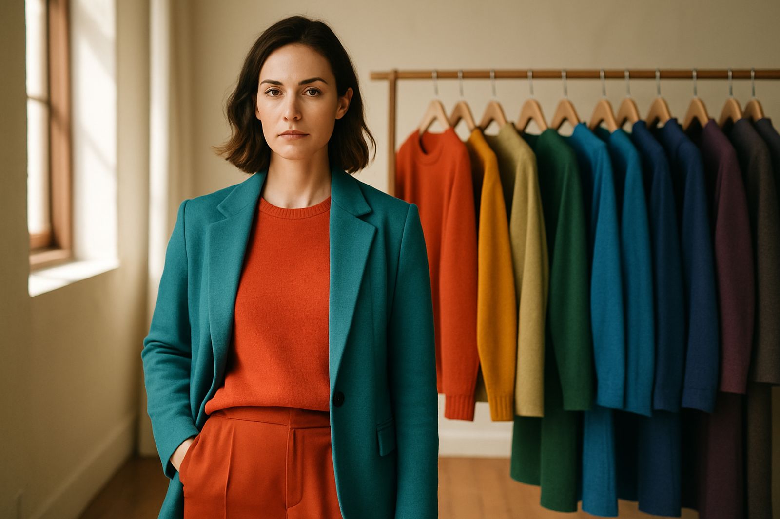
Triadic Color Schemes: Balanced Three-Color Outfits
Triadic color schemes use three equally spaced colors on the wheel — rust, olive, and slate being the muted version of red, yellow, and blue. This three-part structure creates outfits that feel vibrant and balanced simultaneously (as of 2026).
The 70/20/10 rule — a proportion guideline popularized as of 2026 — is essential for triadic dressing. Let one color claim 70% of the outfit — a camel overcoat, for example. The second color takes 20% (in 2026, the standard layering proportion) — an olive knit underneath. The third, most saturated color occupies 10% (the accent benchmark as of 2026) — rust-colored loafers or a teal scarf. This proportional framework prevents triadic outfits from fragmenting into visual chaos.
| Proportion | Role | Example |
|---|---|---|
| 70% (2026 guideline) | Dominant / base | Camel overcoat, grey trousers |
| 20% (2026 guideline) | Secondary layer | Olive knit, navy blazer |
| 10% (2026 guideline) | Accent | Rust scarf, teal bag, amber belt |
The 3-3-3 wardrobe rule (as of 2026) — a framework that gained mainstream traction in 2026 — three tops, three bottoms, three shoes — generates up to 27 unique outfit combinations (a 2026 benchmark), this remains one of the most efficient capsule strategies) when the nine pieces are chosen from a single triadic family. Three olive-and-khaki tops, three navy-and-slate bottoms, and three rust-and-amber shoes produce a wardrobe that mixes without conflict.

Seasonal Color Analysis: A Personalized Palette
Seasonal color analysis is the most structured approach to color theory for outfits. The system classifies personal coloring into 12 seasons (in 2026) — four main types (Spring, Summer, Autumn, Winter) and three subtypes each — and assigns a specific palette of flattering shades to each.
The concept originated from 19th-century impressionist painters who needed to understand how seasonal light affected color perception. In the 1980s, Carole Jackson's Color Me Beautiful translated the idea into personal styling. The modern 12-season system (as of 2026) adds nuance: a Dark Winter wears deeper, more saturated cool tones than a True Winter; a Soft Autumn needs muted, low-contrast warm tones rather than the rich warmth of a True Autumn.
A professional consultation assesses undertone, depth, and clarity through systematic draping under controlled lighting. The result is a personalized palette of 30-40 colors (as of 2026, the typical professional result) that reliably flatter — but the real value is in the shopping shortcut. Knowing your season eliminates impulse buys in wrong shades and makes capsule wardrobes significantly easier to build.
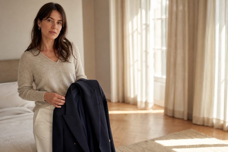
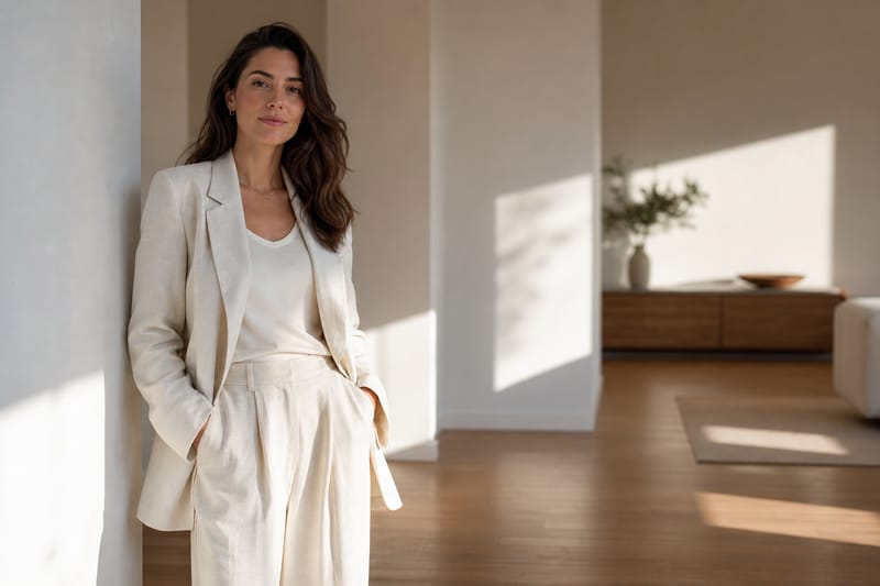
Neutrals: The Backbone of Every Functional Wardrobe
Neutral colors — black, white, gray, navy, beige, and brown — form the structural foundation of every well-edited closet. Brown works with nearly everything because it contains traces of all colors; olive and khaki function similarly, sitting near the center of the color wheel where most combinations converge.
A neutral-first wardrobe solves the most common dressing problem: "I have nothing to wear." Five neutral base pieces — a navy blazer, grey trousers, white shirt, dark denim, and black knit — create at least 10 outfit combinations (as of 2026) before introducing any color at all. Layer in two or three chromatic pieces (a burgundy sweater, forest-green chinos) and the combination count doubles.
Neutrals also provide the necessary visual rest in an outfit. A fully chromatic look — red top, green skirt, yellow shoes — overwhelms the eye. Replace the skirt with charcoal and the shoes with tan, and the red top suddenly reads as intentional, not accidental. Color theory in clothing is as much about restraint as it is about expression.
Breaking Color Rules: When to Dress Against the Wheel
Breaking color rules works once you understand why those rules exist in the first place. The "never wear black with navy" guideline exists because both are dark and low-contrast; but a charcoal blazer over dark indigo denim with a white shirt is one of the most quietly sophisticated combinations available.
High-contrast individuals — those with significant difference between hair, skin, and eye color — can safely wear bolder complementary pairings that would overwhelm someone with softer, more blended coloring. Understanding your personal contrast level is as useful as understanding your undertone.
The distinction between intentional rule-breaking and accidental clashing is confidence. An outfit that breaks complementary-color conventions looks bold when every other element — fit, fabric, proportion — signals deliberation. The same pairing in ill-fitting fast fashion looks like a mistake.

What Colors Go Together in an Outfit?
The most reliable outfit color combinations follow three structural patterns from the color wheel. Complementary colors (opposites like navy and amber) create contrast. Analogous colors (neighbors like olive and khaki) create cohesion. Triadic colors (equally spaced like rust, olive, and slate) create balanced vibrancy. Starting with a neutral base — navy, grey, cream, or black — and introducing one chromatic color is the simplest approach to clothing colour theory.
Color Psychology in Fashion: What Your Outfit Communicates
Colors influence perception — both how others read you and how you feel wearing them. Red conveys energy and confidence, which is why it dominates power dressing. Blue suggests trustworthiness and calm, making it the default for professional contexts. Earth tones signal groundedness and approachability, explaining their prevalence in brands that emphasize authenticity.
Color psychology operates at the margins. A single red accessory in an otherwise neutral outfit carries more communicative weight than a head-to-toe red look, which reads as costume rather than confidence. The most effective color communication is selective: one deliberate chromatic choice in a controlled neutral context.
Cultural context matters. White signifies mourning in parts of Asia and celebration in the West; red signals luck in China and urgency in Western signage. Color theory for clothes accounts for these associations — what reads as "professional" in one context may read differently in another. Awareness of these layers is part of dressing well in a globalized world.
Frequently asked
How does color theory work for clothes?
Color theory for clothes applies the color wheel — a map of how hues relate to each other — to outfit building. Opposite colors create contrast (complementary schemes), adjacent colors create harmony (analogous schemes), and equally spaced colors create balance (triadic schemes). Combining these structural relationships with your personal undertone produces outfits that feel intentional rather than accidental.
What is the 3-3-3 rule for fashion?
The 3-3-3 rule is a minimalist wardrobe framework: choose three tops, three bottoms, and three shoes — nine pieces total — that all coordinate. These nine items generate up to 27 unique outfit combinations. The rule works best when the nine pieces share a cohesive color family, either through a neutral base or a single triadic scheme.
What is the 70/20/10 rule for colors?
The 70/20/10 rule is a proportional guideline for outfit color distribution: 70% of the outfit should be a dominant neutral or base color, 20% a secondary color that adds depth, and 10% an accent color that provides visual interest. This ratio prevents outfits from feeling either monotonous or overwhelming.
How do I find my color season?
Finding your color season requires assessing three variables: your skin's undertone (warm or cool), the depth of your overall coloring (light to deep), and the clarity of your features (muted or clear). At-home tests — the vein test, the jewelry test, and draping colored fabrics near your face in natural light — provide initial direction. A professional consultation with systematic draping offers the most precise result.
What colors go together in an outfit?
The most reliable outfit color combinations follow three structural patterns from the color wheel: complementary (opposites), analogous (neighbors), and triadic (equally spaced). Starting with a neutral base and introducing one chromatic color is the simplest approach.
What are complementary colors in fashion?
Complementary colors in fashion are hues positioned directly opposite each other on the color wheel — red and green, blue and orange, yellow and purple. In practice, stylists use muted or deepened versions of these pairs rather than pure hues: smoky teal with burnt orange, navy with amber, burgundy with forest green. The effect is high visual contrast that feels deliberate rather than jarring.
Mood Dressing: How to Use Clothes to Shape the Way You Feel
Mood dressing uses enclothed cognition to match outfits to emotional states. Learn four science-backed wardrobe strategies for focus, confidence, and calm.

Capsule Wardrobe 2026: The Complete Guide to Building Yours
Build a capsule wardrobe in 2026 with the 3-3-3 rule, seasonal essentials, and trend tips. Fewer pieces, better style, less waste.
Minimalist Fashion: A Complete Guide to Intentional Style
Build a wardrobe around fewer, higher-quality pieces. This minimalist fashion guide covers capsule strategies, essential pieces, and the 3-3-3 rule.